
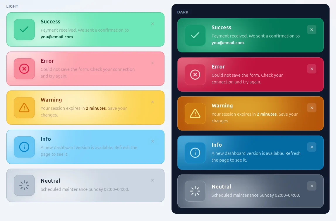
The component has a clearer visual hierarchy (large icon on the left, content on the right), an animated background, and two ready-made color themes. Below I describe installation, markup structure, variants, behavior, and integration examples.
Files and installation
The repository contains:
css/wow-alerts.css— the only required production file,index.html— demo page (light / dark, variants, compact),article_html— this document.
Linking the stylesheet:
<link rel="stylesheet" href="/css/wow-alerts.css" />Dependencies: none. Icons are inline SVG in HTML. JavaScript is optional — needed only when closing an alert with a button (see the “Closing” section).
Rationale relative to Bootstrap 5
BS5 alerts (alert alert-success etc.) fulfill an informational role in the documentation, but in production applications they often blend into the rest of the UI: uniform padding, small icon, no entry animation, no background layer distinguishing the message from the page background. In tests, users skipped messages placed in standard alerts, despite correct semantics (role="alert"). WOW Alerts addresses this through:
- CSS Grid layout: icon column (default 4.5 rem) + content + optional close button,
- animated background “orb” (
::after,filter: blur,wow-orb-driftanimation), - entry animation (
wow-alert-enter) and staggered delays in the list container, - separate palettes
wow-theme-lightandwow-theme-dark, - variant-dependent border:
bordercomputed from the alert’s--wow-accent.
The component does not replace all of Bootstrap — it works alongside it (layout, forms). It replaces only the alert presentation layer where message visibility is critical.
Class model (BEM)
| Class | Scope | Description |
|---|---|---|
wow-alerts |
container | Alert list (flex, column, 1 rem gap). Set the theme here. |
wow-theme-light / wow-theme-dark |
container | Color theme: dark text / white text, separate variant backgrounds. |
wow-alert |
single alert | Main message block. |
wow-alert--success |
modifier | Semantic variant (also: --error, --warning, --info, --neutral). |
wow-alert--compact |
modifier | Smaller icon and padding. |
wow-alert__icon |
element | SVG icon area. |
wow-alert__body |
element | Title + content. |
wow-alert__title |
element | Heading (e.g. “Error”, “Success”). |
wow-alert__message |
element | Content (<p>); <strong> allowed inside. |
wow-alert__close |
element | Close button (optional). |
is-dismissing |
state | Class added before DOM removal — triggers the dismiss animation. |
Minimal example (light theme, success)
<link rel="stylesheet" href="/css/wow-alerts.css" />

<section class="wow-alerts wow-theme-light">
  <article class="wow-alert wow-alert--success" role="alert">
    <span class="wow-alert__icon" aria-hidden="true">
      <svg viewBox="0 0 24 24" width="24" height="24" fill="none"
           stroke="currentColor" stroke-width="2"
           stroke-linecap="round" stroke-linejoin="round">
        <path d="M20 6L9 17l-5-5"/>
      </svg>
    </span>
    <span class="wow-alert__body">
      <strong class="wow-alert__title">Success</strong>
      <p class="wow-alert__message">Profile changes saved.</p>
    </span>
  </article>
</section>
In the documentation I use <section> instead of a generic container — the wow-alerts class can be on any block element. In the demo (index.html) an element with class wow-alerts is used; semantically equivalent is <section class="wow-alerts …">.
Full markup with close button and icon
<section class="wow-alerts wow-theme-light">
  <article class="wow-alert wow-alert--error" role="alert">
    <span class="wow-alert__icon" aria-hidden="true">
      <svg viewBox="0 0 24 24" fill="none" stroke="currentColor" stroke-width="2"
           stroke-linecap="round" stroke-linejoin="round">
        <circle cx="12" cy="12" r="10"/>
        <path d="M15 9l-6 6M9 9l6 6"/>
      </svg>
    </span>
    <span class="wow-alert__body">
      <strong class="wow-alert__title">Error</strong>
      <p class="wow-alert__message">
        Failed to save the form. Check your network connection.
      </p>
    </span>
    <button type="button" class="wow-alert__close"
            aria-label="Close message">×</button>
  </article>
</section>
Dark theme
I set the theme only on the list container. All children inherit color variables defined in .wow-theme-dark .wow-alert--*.
<section class="wow-alerts wow-theme-dark">
  <article class="wow-alert wow-alert--warning" role="alert">
    <span class="wow-alert__icon" aria-hidden="true">
      <svg viewBox="0 0 24 24" fill="none" stroke="currentColor" stroke-width="2"
           stroke-linecap="round" stroke-linejoin="round">
        <path d="M12 9v4M12 17h.01"/>
        <path d="M10.29 3.86L1.82 18a2 2 0 001.71 3h16.94a2 2 0 001.71-3L13.71 3.86a2 2 0 00-3.42 0z"/>
      </svg>
    </span>
    <span class="wow-alert__body">
      <strong class="wow-alert__title">Warning</strong>
      <p class="wow-alert__message">
        Session expires in <strong>2 minutes</strong>. Save your changes.
      </p>
    </span>
  </article>
</section>
In the dark theme: --wow-text: #ffffff, darker variant backgrounds (e.g. success #047857), lighter orb (--wow-orb) and lighter icon stroke (--wow-icon-stroke).
Semantic variants
I combine exactly one variant modifier with an alert:
wow-alert--success   /* operation completed successfully */
wow-alert--error     /* error requiring action */
wow-alert--warning   /* risk / deadline / data loss */
wow-alert--info      /* contextual information */
wow-alert--neutral   /* system message without emotional valence */
Example of all five in one container (fragment):
<section class="wow-alerts wow-theme-light">
  <article class="wow-alert wow-alert--success" role="alert">…</article>
  <article class="wow-alert wow-alert--error" role="alert">…</article>
  <article class="wow-alert wow-alert--warning" role="alert">…</article>
  <article class="wow-alert wow-alert--info" role="alert">…</article>
  <article class="wow-alert wow-alert--neutral" role="alert">…</article>
</section>
Successive alerts in wow-alerts get increasing entry animation-delay and different background orb animation phases (nth-child on ::after), so they do not move in sync.
Compact version
<article class="wow-alert wow-alert--success wow-alert--compact" role="alert">
  <span class="wow-alert__icon" aria-hidden="true">…</span>
  <span class="wow-alert__body">
    <strong class="wow-alert__title">Saved</strong>
    <p class="wow-alert__message">Profile settings updated.</p>
  </span>
</article>
Effect: --wow-icon-size: 3.25rem, smaller padding, smaller SVG icon.
Closing an alert (JavaScript)
CSS defines the wow-dismiss animation for the is-dismissing class. Script from the demo:
document.querySelectorAll(".wow-alert__close").forEach(function (btn) {
  btn.addEventListener("click", function () {
    var alert = btn.closest(".wow-alert");
    alert.classList.add("is-dismissing");
    alert.addEventListener("animationend", function () {
      alert.remove();
    }, { once: true });
  });
});
For critical messages (e.g. an error blocking form submission) I omit the wow-alert__close button — the user must fix the problem, not dismiss the message.
Injecting an alert from the backend (PHP)
<?php if ($flash = $_SESSION['flash_error'] ?? null): ?>
  <section class="wow-alerts wow-theme-light">
    <article class="wow-alert wow-alert--error" role="alert">
      <span class="wow-alert__icon" aria-hidden="true">
        <!-- error SVG -->
      </span>
      <span class="wow-alert__body">
        <strong class="wow-alert__title">Error</strong>
        <p class="wow-alert__message"><?= htmlspecialchars($flash) ?></p>
      </span>
    </article>
  </section>
  <?php unset($_SESSION['flash_error']); endif; ?>
Accessibility
role="alert"— for messages requiring immediate attention (screen readers announce the content).aria-hidden="true"on the icon — content is in the title and paragraph.aria-labelon the close button — the “×” text alone is not enough.prefers-reduced-motion: reduce— disables entry, orb, and shine animations; leaves a static, high-contrast layout.
Visual behavior (CSS implementation)
Summary of what the stylesheet does — useful for debugging and extending:
- Grid on
.wow-alert:grid-template-columns: var(--wow-icon-size) 1fr auto. - Background orb:
::afterpseudo-element, circle,filter: blur(52px),wow-orb-driftanimation (14 s). - Shine on hover:
::before,wow-shineanimation when hovering over the alert. - Border:
1px solid color-mix(in srgb, var(--wow-accent) 38%, transparent)— color from the variant accent, not global. - Icon: background
color-mix(var(--wow-bg), var(--wow-accent)), stroke from--wow-accentor--wow-icon-strokein dark.
Overriding colors (CSS variables)
On a single alert I can set custom values (they override the theme):
<article class="wow-alert wow-alert--info" role="alert"
         style="--wow-bg: #1e3a5f; --wow-accent: #60a5fa; --wow-orb: #93c5fd;">
  …
</article>
Typical variables set per variant in the CSS file:
--wow-bg          /* alert background */
--wow-orb         /* blurred orb color */
--wow-accent      /* accent: border, icon */
--wow-text        /* title and strong in content */
--wow-muted       /* paragraph color */
--wow-icon-stroke /* optional: SVG stroke color in dark */
Coexistence with Bootstrap 5
Example: BS5 form, WOW alert above it.
<link href="/bootstrap.min.css" rel="stylesheet" />
<link href="/css/wow-alerts.css" rel="stylesheet" />

<main class="container py-4">
  <section class="wow-alerts wow-theme-light mb-4">
    <article class="wow-alert wow-alert--error" role="alert">
      …validation message…
    </article>
  </section>

  <form class="row g-3">
    <!-- Bootstrap fields -->
  </form>
</main>
WOW classes do not conflict with BS prefixes — I do not override .alert. I can keep BS for layout and WOW only for high-importance messages.
When I use WOW Alerts, and when I do not
| Situation | Recommendation |
|---|---|
| Save error, session loss, payment confirmation | WOW Alert (--error, --warning, --success) |
| Single form field error | Text next to the field (invalid-feedback in BS), not a global alert |
| Short “copied to clipboard” | Toast / small message; optionally wow-alert--compact |
| Marketing, promotional banners | No — overuse reduces the effectiveness of operational alerts |
Ready-made SVG icons (copy-paste)
All icons: viewBox="0 0 24 24", fill="none", stroke="currentColor", stroke-width="2". Color is controlled by CSS (stroke on .wow-alert__icon svg).
Success
<svg viewBox="0 0 24 24" fill="none" stroke="currentColor" stroke-width="2"
     stroke-linecap="round" stroke-linejoin="round">
  <path d="M20 6L9 17l-5-5"/>
</svg>
Error
<svg viewBox="0 0 24 24" fill="none" stroke="currentColor" stroke-width="2"
     stroke-linecap="round" stroke-linejoin="round">
  <circle cx="12" cy="12" r="10"/>
  <path d="M15 9l-6 6M9 9l6 6"/>
</svg>
Warning
<svg viewBox="0 0 24 24" fill="none" stroke="currentColor" stroke-width="2"
     stroke-linecap="round" stroke-linejoin="round">
  <path d="M12 9v4M12 17h.01"/>
  <path d="M10.29 3.86L1.82 18a2 2 0 001.71 3h16.94a2 2 0 001.71-3L13.71 3.86a2 2 0 00-3.42 0z"/>
</svg>
Info
<svg viewBox="0 0 24 24" fill="none" stroke="currentColor" stroke-width="2"
     stroke-linecap="round" stroke-linejoin="round">
  <circle cx="12" cy="12" r="10"/>
  <path d="M12 16v-4M12 8h.01"/>
</svg>
Color palette (default)
Values set in wow-alerts.css — reference point for contrast audit:
| Variant | Light: background (--wow-bg) |
Light: accent | Dark: background | Dark: accent |
|---|---|---|---|---|
| success | #6ee7b7 |
#059669 |
#047857 |
#34d399 |
| error | #fda4af |
#e11d48 |
#be123c |
#fb7185 |
| warning | #fcd34d |
#d97706 |
#b45309 |
#fbbf24 |
| info | #7dd3fc |
#0284c7 |
#0369a1 |
#38bdf8 |
| neutral | #cbd5e1 |
#64748b |
#475569 |
#cbd5e1 |
Dynamically adding an alert (JavaScript)
function showWowAlert(container, variant, title, message, theme) {
  theme = theme || "light";
  var article = document.createElement("article");
  article.className = "wow-alert wow-alert--" + variant;
  article.setAttribute("role", "alert");
  article.innerHTML =
    '<span class="wow-alert__icon" aria-hidden="true">' +
      iconSvgFor(variant) +
    "</span>" +
    '<span class="wow-alert__body">' +
      "<strong class=\"wow-alert__title\">" + title + "</strong>" +
      '<p class="wow-alert__message">' + message + "</p>" +
    "</span>" +
    '<button type="button" class="wow-alert__close" aria-label="Close">×</button>';
  var list = document.querySelector(container);
  if (!list.classList.contains("wow-theme-" + theme)) {
    list.className = "wow-alerts wow-theme-" + theme;
  }
  list.prepend(article);
  bindCloseButton(article.querySelector(".wow-alert__close"));
}
After a fetch returning a JSON error I call showWowAlert("#alerts", "error", "Error", data.message) instead of the browser’s alert() — consistent look with the rest of the application.
Extending with a custom variant
New type (e.g. “maintenance”) I add in CSS:
.wow-theme-light .wow-alert--maintenance {
  --wow-accent: #7c3aed;
  --wow-bg: #c4b5fd;
  --wow-orb: #f5f3ff;
  --wow-text: #3b0764;
  --wow-muted: color-mix(in srgb, var(--wow-text) 50%, #fff);
}

.wow-theme-dark .wow-alert--maintenance {
  --wow-accent: #a78bfa;
  --wow-icon-stroke: #ddd6fe;
  --wow-bg: #5b21b6;
  --wow-orb: #c4b5fd;
}
In HTML: class="wow-alert wow-alert--maintenance".
Common integration mistakes
- Green border on all variants — the border is computed from
--wow-accenton the alert itself. If thewow-alert--errorclass (etc.) is missing, the inherited accent may be wrong. I always set the full variant class set. - Theme on a single alert instead of the container —
wow-theme-lightmust be onwow-alerts; otherwise.wow-theme-light .wow-alert--*selectors will not apply. - Icon not visible — SVG without stroke attributes or with
fillinstead of outline; I use the pattern from the “Ready-made SVG icons” section. - Content obscured by the orb — content and icon have
z-index: 1; if I add custom layers, they must not create a new stacking context above pseudo-elements unnecessarily.
Example in a Blade template (Laravel)
@if (session('status'))
  <section class="wow-alerts wow-theme-light mb-3">
    <article class="wow-alert wow-alert--success" role="alert">
      <span class="wow-alert__icon" aria-hidden="true">
        @include('icons.check')
      </span>
      <span class="wow-alert__body">
        <strong class="wow-alert__title">Success</strong>
        <p class="wow-alert__message">{{ session('status') }}</p>
      </span>
    </article>
  </section>
@endif

@if ($errors->any())
  <section class="wow-alerts wow-theme-light mb-3">
    @foreach ($errors->all() as $error)
      <article class="wow-alert wow-alert--error" role="alert">
        <span class="wow-alert__icon" aria-hidden="true">@include('icons.x-circle')</span>
        <span class="wow-alert__body">
          <strong class="wow-alert__title">Validation error</strong>
          <p class="wow-alert__message">{{ $error }}</p>
        </span>
      </article>
    @endforeach
  </section>
@endif
In the layout I load wow-alerts.css once in <head>. Blade components can be extracted to resources/views/components/wow-alert.blade.php with parameters variant, title, slot — then views need only one line: <x-wow-alert variant="error" title="Error">Content</x-wow-alert>.
Browser requirements
The stylesheet uses color-mix(), CSS Grid, @keyframes animations, ::before / ::after pseudo-elements. In practice: Chrome 111+, Firefox 113+, Safari 16.2+. In older browsers alerts will display without color mixes (worth testing a fallback if I support legacy).
Summary
WOW Alerts was created to address a specific gap: Bootstrap 5 does not guarantee that the user will notice content they must see. I provide a single CSS file, predictable BEM markup, two themes, and five semantic variants. Integration boils down to linking the stylesheet and inserting the structure with an SVG icon — the rest (variant colors, background animations, entry, responsiveness below 480 px) is handled by the stylesheet. Full live examples are in index.html.
Markup comparison: Bootstrap 5 vs WOW Alerts
Bootstrap 5 (success alert):
<div class="alert alert-success" role="alert">
  Operation completed successfully.
</div>
WOW Alerts (same case):
<section class="wow-alerts wow-theme-light">
  <article class="wow-alert wow-alert--success" role="alert">
    <span class="wow-alert__icon" aria-hidden="true"><svg>…</svg></span>
    <span class="wow-alert__body">
      <strong class="wow-alert__title">Success</strong>
      <p class="wow-alert__message">Operation completed successfully.</p>
    </span>
  </article>
</section>
WOW requires more markup, but gives control over title, content, icon, and theme. In projects where operational message visibility matters, I accept this markup overhead.
Pre-production deployment checklist
- Is the correct theme on the container (
wow-theme-light/dark)? - Does each alert have exactly one
wow-alert--*modifier? - Does a critical message lack a close button without business logic?
- Is
role="alert"not overused for marketing content? - Does text contrast on the variant background pass WCAG in the chosen theme?
- Was the view tested with
prefers-reduced-motion: reduce?
Quick reference:
<link rel="stylesheet" href="/css/wow-alerts.css" />
<section class="wow-alerts wow-theme-light">
  <article class="wow-alert wow-alert--success" role="alert">
    <span class="wow-alert__icon" aria-hidden="true"><svg>…</svg></span>
    <span class="wow-alert__body">
      <strong class="wow-alert__title">Title</strong>
      <p class="wow-alert__message">Content.</p>
    </span>
    <button type="button" class="wow-alert__close" aria-label="Close">×</button>
  </article>
</section>