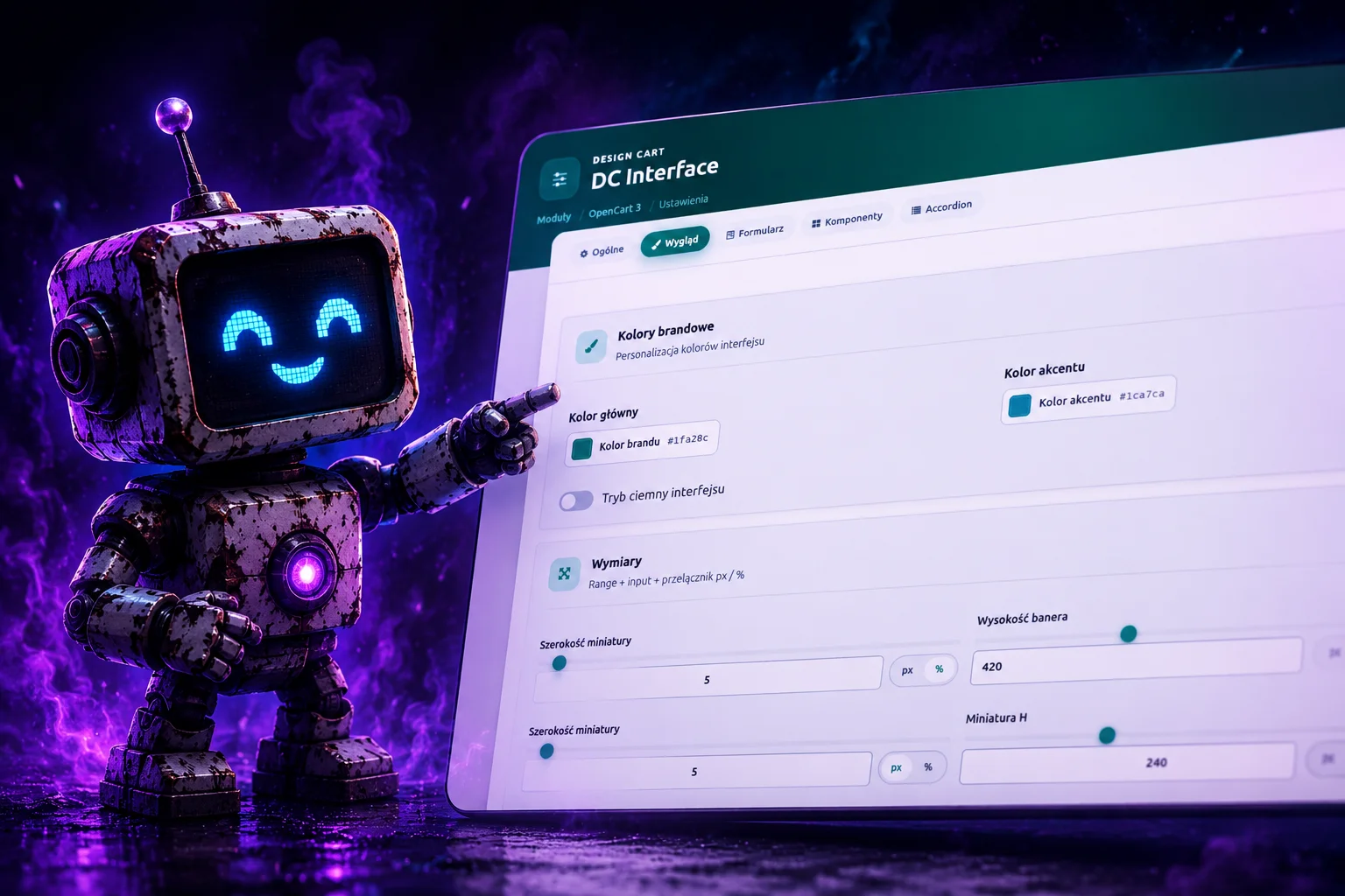
The system is used (or intended for use) in modules for PrestaShop, OpenCart, and WordPress, as well as in other environments with a classic PHP-based admin panel and POST forms. It is not a general front-end library for public websites, but a specialized set of components, layouts, and interactions tailored to one scenario: the module configuration screen in the backend.
Every commercial or in-house module in the e-commerce or WordPress ecosystem requires a settings page. That page usually contains dozens of fields — toggles, text fields, color pickers, image dimensions, tabs grouped by category, multilingual sections. PrestaShop, OpenCart, and WordPress ship their own admin templates (often based on Bootstrap or their own CSS frameworks), which are functional but visually disconnected from the Design Cart brand identity. Over the years, individual products — blog, forms, galleries, integrations — received their own CSS tweaks and JavaScript fragments on each platform separately. The outcome was predictable: similar elements looked slightly different in every module and on every CMS, and maintenance required copying code between projects.
DC Interface was created to eliminate this problem once and for all — across platforms. The goal is one package of CSS and JS files and one set of HTML patterns (in Twig, Smarty, or plain PHP templates) that look and behave identically in all Design Cart modules. A shop owner configuring a module in PrestaShop should see the same interface as a module administrator in OpenCart or a plugin user in WordPress. Consistency builds brand trust and lowers the learning curve when switching between products — regardless of which CMS the client works on.
The second, equally important reason for creating the system is isolation from native admin panel styles. Each of the listed platforms loads global stylesheets that aggressively override margins, fonts, and colors of form elements. Without a scoped container, every attempt to aesthetically refine a text field ends in a fight over CSS selector specificity — in the PrestaShop back office, OpenCart admin, and WP plugin settings screen alike. DC Interface solves this through the .dc-interface container, inside which its own reset and typography run. Module styles do not “bleed” into the rest of the panel, and panel styles — to a large extent — do not break the module form.
The third reason is atypical components. Standard HTML fields are not enough in e-commerce and WordPress module settings. You need a color picker with an eyedropper and brand presets, a dimension control with a slider and px/% switch, switch buttons instead of raw radio and checkbox inputs, and a drag-and-drop zone for attachments. Such elements had to be built from scratch in every module and on every platform. DC Interface delivers them as ready-made JavaScript classes with auto-initialization via data-dc-* attributes, which shortens the time to deploy a new module from days to hours — regardless of whether integration happens through wp_enqueue_script, addCSS in PrestaShop, or addScript in OpenCart.
The fourth reason is the visual reference from the dc_blog module. The Design Cart blog module had the most polished settings screen in the entire product line: a hero with the brand gradient, a form card overlapping the banner, pill-style tabs, and sections in separate cards with an icon and subtitle. DC Interface was deliberately extracted from that module and generalized so that every subsequent product could immediately use the same level of polish without copying sf-blog-admin.css files and fragments of the settings.twig template.
2. The problem it solves
Without DC Interface, the implementation team faced the following costs:
- Code duplication — the same color picker, the same tab layout, the same “Save” button styles copied manually into every module on PrestaShop, OpenCart, and WordPress.
- Visual drift — shades of green (#1fa28c vs #1e9d87), different button border radii, inconsistent section card shadows.
- CSS conflicts — Bootstrap
.form-controlrules breaking custom classes, double borders, poor focus states. - No HTML standard — in one module tabs on
data-sf-tab, in another onhref="#panel", in a third plain Bootstrap tabs. - Difficult testing — no single demo page showing all components at once before deployment into a module template (Twig, Smarty, PHP).
DC Interface addresses each of these points: one file package, one demo file (index.html), one class naming convention with the dc- prefix, explicit backward compatibility with the sf- prefix used in older modules, and CSS scope limiting the impact of external frameworks.
3. Origin: from Super Form to DC Interface
The project started in a repository working-titled “super_form”. Early iterations focused on elegant forms — hence the name. As it evolved, the need extended far beyond forms alone: a hero, module page layout, tabs, accordion, and specialized components were required. The name “Super Form” became misleading because the system covers the entire settings screen, not just the <form> tag.
The rebrand to DC Interface reflects the actual scope: it is the interface of Design Cart (DC) modules, not a single form component. Files super-form.css and sf-colorpicker.* were replaced with dc-interface.css, dc-colorpicker.js, and so on. The class prefix was changed from the dominant sf- to dc-, while keeping aliases in JavaScript and CSS where older templates still use data-sf-tab or sf-tabs.
The super_form repository today serves as a laboratory and living documentation — the index.html file is a full preview of all components that can be opened in a browser without installing any CMS. The first production deployments were built for OpenCart modules (including dc_blog), but portability to PrestaShop and WordPress was an assumption from the start.
4. Design philosophy
4.1. Vanilla first
DC Interface does not require React, Vue, jQuery, or a build step. CSS is plain stylesheets with @import. JavaScript is native ES6 classes wrapped in an IIFE, exported to window. It runs in a typical admin panel environment (PrestaShop back office, OpenCart admin, WordPress wp-admin), where there is no node_modules or webpack. It is enough to copy the css/ and js/ folders into the module/plugin directory and link them using the given platform’s mechanism.
4.2. Scope instead of a global reset
We do not reset the entire admin panel. Reset and typography apply only inside .dc-interface. Page layout (.dc-page, .dc-hero, .dc-form-card) works outside the form, but still uses the same --dc-* tokens defined on .dc-page and .dc-interface.
4.3. Progression through CSS layers
The dc-forms.css file organizes rules in layers @layer dc-interface.reset, base, components. This makes overriding in modules easier without escalating !important, though in practice most modules should not require overrides.
4.4. Data in the DOM, not in application state
Components such as the color picker and dimension generate hidden type="hidden" inputs with name attributes matching the module backend convention. A form submitted via POST contains ready values — the PHP layer (module controller, WordPress plugin class, ModuleAdminController in PrestaShop) reads e.g. image_width and image_width_unit without additional client-side serialization. The same form HTML works on all platforms; only the way assets are attached and options are saved to the database changes.
4.5. Accessibility as baseline
Tabs use role="tablist", role="tab", aria-selected. Accordion controls aria-expanded. Unit switches in dimension are real radio inputs with a hidden input, not divs with onclick. Focus visible has a clear brand outline.
5. File architecture
Main CSS entry point:
css/dc-interface.cssImports in order:
dc-tokens.css—--dc-*variables (colors, spacing, shadows, typography)dc-hero.css— module header bannerdc-layout.css— form card, section cardsdc-tabs.css— pill tab navigationdc-accordion.css— collapsible sectionsdc-switch.css— switch buttons and toggledc-dimension.css— dimension componentdc-forms.css— fields, buttons, validation, drop zonedc-colorpicker.css— color picker
JavaScript:
js/dc-interface.js— tabs, language tabs, accordion, file drop, component auto-initjs/dc-colorpicker.js—DCColorPickerclassjs/dc-dimension.js—DCDimensionclass
Script load order (adjust paths to your module structure on the given platform):
<script src="/.../dc-colorpicker.js"></script>
<script src="/.../dc-dimension.js"></script>
<script src="/.../dc-interface.js"></script>
dc-interface.js must be last — it calls initAll(), which looks for DCColorPicker and DCDimension classes on window.
6. CMS integration (PrestaShop, OpenCart, WordPress)
DC Interface is platform neutral. Component HTML, CSS classes, and JavaScript logic are identical everywhere. Only the way static files are included and the settings page template is rendered differs. Below are common rules and brief instructions for the three main target platforms.
6.1. Common rules (all platforms)
- Copy the
css/andjs/directories from the repository into the module/plugin (one package copy per product). - In the admin panel, load
dc-interface.cssand the three JS scripts in the given order (colorpicker → dimension → interface). - Wrap the settings page content in
.dc-page→ optionally.dc-hero→.dc-form-card→.dc-interface. - Configuration form: classic
method="post"withnamefields matching the save logic in PHP on the given platform. - Insert values saved in the database into
data-value,data-unit,value="", etc. when rendering the template. - Test the layout dry-run via
index.htmlin the repository before deploying to a CMS.
HTML skeleton of the settings page (independent of the template engine):
<div class="dc-page">
  <div class="dc-hero">...header, breadcrumb, buttons...</div>
  <div class="dc-page__wrap">
    <div class="dc-form-card">
      <div class="dc-interface">
        <form action="SAVE_URL" method="post" class="dc-form dc-form--full">
          <nav class="dc-nav dc-tabs" role="tablist">...</nav>
          <div class="dc-form-card__body">
            <div id="tab-general" class="dc-tab-panel dc-active">...</div>
            <div id="tab-appearance" class="dc-tab-panel">...</div>
            <div class="dc-actions">
              <button type="submit" class="dc-btn dc-btn--primary">Save</button>
            </div>
          </div>
        </form>
      </div>
    </div>
  </div>
</div>
6.2. OpenCart 3 (example)
First production deployment — dc_blog module. Directory structure:
upload/admin/view/
  stylesheet/dc-interface.css
  javascript/dc-interface.js
  javascript/dc-colorpicker.js
  javascript/dc-dimension.js
  template/extension/module/nazwa_modulu.twig
In the module controller, in the settings view method:
$this->document->addStyle('view/stylesheet/dc-interface.css');
$this->document->addScript('view/javascript/dc-colorpicker.js');
$this->document->addScript('view/javascript/dc-dimension.js');
$this->document->addScript('view/javascript/dc-interface.js');
Templates in Twig; values from the settings array, e.g. data-value="{{ settings.image_width }}". POST read: $this->request->post['image_width'].
6.3. PrestaShop (example)
Typical location in a 1.7/8.x module:
modules/nazwa_modulu/
  views/css/dc-interface.css
  views/js/dc-interface.js
  views/js/dc-colorpicker.js
  views/js/dc-dimension.js
  views/templates/admin/configure.tpl
In a class extending ModuleAdminController (or in the module’s getContent()):
$this->context->controller->addCSS($this->_path . 'views/css/dc-interface.css');
$this->context->controller->addJS($this->_path . 'views/js/dc-colorpicker.js');
$this->context->controller->addJS($this->_path . 'views/js/dc-dimension.js');
$this->context->controller->addJS($this->_path . 'views/js/dc-interface.js');
Templates are often in Smarty (.tpl); syntax differs from Twig, but DC Interface markup stays the same. Configuration saved via Configuration::updateValue() or a custom table; form fields must have name matching keys read on save. PrestaShop back office has its own Bootstrap — the .dc-interface scope is especially important here.
6.4. WordPress (example)
Typical location in a plugin:
wp-content/plugins/nazwa-wtyczki/
  assets/css/dc-interface.css
  assets/js/dc-interface.js
  assets/js/dc-colorpicker.js
  assets/js/dc-dimension.js
  admin/views/settings-page.php
Asset registration on the admin_enqueue_scripts hook (only on the plugin screen):
wp_enqueue_style('dc-interface', plugins_url('assets/css/dc-interface.css', __FILE__));
wp_enqueue_script('dc-colorpicker', plugins_url('assets/js/dc-colorpicker.js', __FILE__), array(), null, true);
wp_enqueue_script('dc-dimension', plugins_url('assets/js/dc-dimension.js', __FILE__), array(), null, true);
wp_enqueue_script('dc-interface', plugins_url('assets/js/dc-interface.js', __FILE__), array(), null, true);
Settings page: a custom admin menu subpage (add_menu_page / add_options_page) or a tab under Settings. Save via update_option(), Settings API, or a custom admin_post_* handler. Nonce and capability (manage_options) are added on the WordPress side — DC Interface does not provide them because that is the plugin’s responsibility. The WP admin panel also loads global styles; the .dc-interface container isolates the form.
6.5. Font Awesome
Icons in the hero, tabs, and section cards assume Font Awesome 4.7 (class fa fa-*). Include a CDN or local copy — on each platform separately if the admin panel does not already load FA globally. In WordPress you can use wp_enqueue_style for Font Awesome; in PrestaShop and OpenCart — addCSS / addStyle.
7. Design tokens (CSS custom properties)
All tokens are defined on the .dc-interface and .dc-page selectors in dc-tokens.css. This allows local overrides on a single module without editing the package source.
7.1. Brand colors
--dc-brand: #1fa28c— primary Design Cart green--dc-accent: #1ca7ca— turquoise accent--dc-dark: #262c38— text color and dark surfaces--dc-ink: #0f172a— high-contrast headings
Primary button and range slider gradients combine brand with accent at 135 degrees. Focus glow (--dc-brand-glow) uses brand RGB with alpha 0.35.
7.2. Semantic colors
--dc-success: #22a06b--dc-error: #e5484d--dc-warning: #f5a623
7.3. Surfaces and borders
--dc-bg,--dc-bg-muted,--dc-surface,--dc-surface-2--dc-border: #d8dee8--dc-line: rgba(15, 23, 42, 0.08)— subtle lines between sections
7.4. Geometry
--dc-radius-sm: 6px— input fields, small elements--dc-radius: 10px--dc-radius-lg: 14px--dc-radius-xl: 18px— main form card--dc-radius-full: 9999px— pill tabs, primary buttons
7.5. Spacing and shadows
Spacing scale from --dc-space-xs (0.25rem) to --dc-space-xl (2rem). Form card shadow --dc-shadow-card is a multi-layer depth effect used on .dc-form-card — a key visual element distinguishing Design Cart modules from flat, default CMS admin panel forms.
8. Module layout
The layout layer consists of three levels:
.dc-page— wrapper for the entire module page, background, font, text color..dc-hero— top banner with gradient (see section 9)..dc-form-card— white card with rounded corners, negative top margin (margin-top: -2.75rem), overlapping the hero and creating the characteristic “floating card” effect above the banner — exactly as in dc_blog settings.
Inside the card: .dc-form-card__body with 1.5–1.75rem padding. A form with class dc-form--full stretches to the full card width (default dc-form has max-width 640px for narrow standalone forms).
Alias .dc-card is equivalent to .dc-form-card for compatibility with older templates.
9. Hero — header banner
Hero is not in the .dc-interface scope — it is a marketing and navigation element of the module page. It consists of:
.dc-hero__mesh— gradient background (dark green → brand → accent).dc-hero__orb— blurred decorative orbs.dc-hero__logo— semi-transparent Design Cart logo (assets/dc-logo-white.png), rotated, blend mode screen.dc-hero__inner— content container with max-width 1320px.dc-hero__row— row with module title and action buttons (Save, Back).dc-hero__bc— breadcrumb (e.g. Modules → PrestaShop / OpenCart / WordPress → Module name)
Hero buttons: dc-btn--light (white background) and dc-btn--ghost (transparent). The Save button in the hero can use the form="formId" attribute to submit a form located lower in the DOM — a pattern known from dc_blog.
10. Forms and fields
All field classes work only inside .dc-interface.
10.1. Layout
.dc-form— flex column with--dc-space-lggap.dc-row/.dc-row--2— one or two column grid (from 540px).dc-field— label + control + hint/error wrapper.dc-label— label; modifierdc-label--requiredadds a red asterisk.dc-hint— helper text below the field
10.2. Text controls
.dc-input— text, email, number, password.dc-textarea.dc-select— native select with styled arrow
States: focus with brand outline and box-shadow glow. In .dc-form-card, fields have slightly larger padding and border radius — a visual upgrade over bare .dc-interface.
10.3. Checkbox and radio
.dc-check+.dc-check__input+.dc-check__box.dc-radio+.dc-radio__input+.dc-radio__dot.dc-radio-group--inline— horizontal layout
Visual markers are built on pseudo-elements; the real input is moved off-screen or hidden, but remains in tab order and in the POST form.
10.4. Buttons
.dc-btn— base.dc-btn--primary— brand/accent gradient, pill, shadow.dc-btn--light,.dc-btn--ghost— variants on dark hero
Action block at the bottom of the form: .dc-actions with a top separator line.
10.5. HTML5 validation
The demo in index.html shows the pattern: on submit checkValidity() is checked, dc-invalid or dc-valid classes are applied to .dc-field, and the .dc-error-msg message is shown via CSS only in the invalid state. There is no custom validation framework — native browser validation is enough in module scope where rules are simple (required, email, minlength).
11. Tabs and navigation
Tab navigation uses classes .dc-nav.dc-tabs. Tab buttons: .dc-nav__btn.dc-tabs__btn with attribute data-dc-tab="panel-id".
Active tab and panel have class dc-active (and alias is-active for old blog styles). Panels: .dc-tab-panel with id matching the data-dc-tab value.
Critical JavaScript implementation rule (fixed after the “disappearing tabs” bug): the script switches only direct children of the panel container that are .dc-tab-panel, not all panels in the entire card. The container is detected automatically (.dc-form-card__body) or can be specified explicitly:
data-dc-tab-panels=".dc-form-card__body"For nested tabs (e.g. tabs inside a tab), use separate groups with their own panel container.
12. Section cards
Instead of a flat field layout, settings are grouped in .dc-section-card:
.dc-section-card__head— header with icon and text.dc-section-card__icon— square icon with gradient background.dc-section-card__title— section title (e.g. “Brand colors”).dc-section-card__sub— explanatory subtitle
The card has a subtle background gradient, thin --dc-line border, and light shadow. Inside, standard .dc-field and special components are used. Class .dc-section on the same card enables a flex column with gaps between fields.
This pattern comes directly from dc_blog settings.twig and is one of the most recognizable brand visual elements in the admin panel.
13. Switch buttons and toggle
13.1. Switch buttons
Group .dc-switch-group turns radio or checkbox into pill buttons. Each option is label.dc-switch-btn with hidden .dc-switch-btn__input and visible .dc-switch-btn__label.
Variant dc-switch-group--solid fills the active option with the brand gradient — ideal for plan selection, display mode (list/grid), sorting.
Advantages over native radio: larger click area, readability on mobile, consistency with pill tabs.
13.2. Toggle
label.dc-toggle with checkbox .dc-toggle__input and element .dc-toggle__track — classic on/off switch (e.g. dark mode, enable/disable module). Track background animation uses transition from the --dc-transition token.
14. Accordion
Structure:
<div class="dc-accordion" data-dc-accordion-single>
  <div class="dc-accordion__item dc-open">
    <button type="button" data-dc-accordion-trigger aria-expanded="true">...</button>
    <div class="dc-accordion__panel">
      <div class="dc-accordion__content">
        <div class="dc-accordion__body">Content</div>
      </div>
    </div>
  </div>
</div>
Attribute data-dc-accordion-single on the container enforces “only one section open” mode. Class dc-open on the item expands the panel; height animated via CSS grid or max-height in dc-accordion.css.
Accordion works where tabs would be overkill — e.g. advanced SEO settings, collapsible permission sections, expert options.
15. Color Picker
Standalone vanilla JS component. Declarative initialization:
<div class="dc-colorpicker"
  data-dc-colorpicker
  data-name="brand_color"
  data-value="#1fa28c"
  data-label="Brand color"></div>
Programmatic:
new DCColorPicker(element, {
  value: '#1ca7ca',
  onChange: function(c) { console.log(c.hex); }
});
Attribute data-manual disables auto-init — needed when manually configuring callbacks before the first render.
15.1. Features
- HSV panel with color field, saturation/brightness, and hue slider
- Hex text field with validation
- Default presets including Design Cart brand colors
- Eyedropper: native EyeDropper API in Chrome/Edge; fallback sampling color from the page
- Hidden input
namewith current hex for POST - Event
dc:colorchangewith detail includinghex,rgb
The color picker was the first “atypical” component in the super_form line and became the pattern for dimension: ES6 class, initAll(), data attributes, hidden input, custom event.
16. Dimension — px / % dimensions
Component for setting width, height, and other numeric dimensions with a unit — a typical pattern in image and layout settings on all three platforms (separate value and unit fields in configuration or database).
<div class="dc-dimension"
  data-dc-dimension
  data-name="image_width"
  data-unit-name="image_width_unit"
  data-label="Thumbnail width"
  data-value="38"
  data-unit="%"
  data-min="1"
  data-max-px="2000"
  data-max-pct="100"></div>
16.1. UI elements
- Slider
input type="range"— quick change on a scale - Field
input type="number"— precise value - Pill px / % switch — two radios in
.dc-dimension__units
16.2. Configuration attributes
data-name— hidden input name for numeric valuedata-unit-name— hidden input name for unit (default{name}_unit)data-min— minimum (default 1)data-max-px— maximum for px (default 2000)data-max-pct— maximum for % (default 100)data-step— slider step (default 1)data-fixed-unit="px"— variant without switch, pixels only (e.g. banner height)
16.3. JavaScript API
DCDimension.initAll();
// instance methods:
instance.setValue(420);
instance.setUnit('px');
instance.getValue(); // { value, unit, css: "420px" }
Event: dc:dimensionchange with detail.css ready for live preview.
16.4. Dimension pair
Container .dc-dimension-pair lays out two components side by side in a grid from 540px — typical width + thumbnail height layout. CSS also includes class .dc-dimension-pair__shared-units for a future variant with a shared unit switch for both axes.
17. Language tabs
Multilingual shops and sites require separate fields per language (PrestaShop: fields per id_lang; OpenCart: arrays with language_id; WordPress: Polylang/WPML or separate options). DC Interface provides the .dc-lang-pills pattern with buttons data-dc-lang="lang-pl" and panels .dc-lang-panel with matching ids.
Logic in initLangTabs() limits scope to the nearest .dc-section or .dc-section-card, so multiple language groups on one page do not conflict.
18. File drag-and-drop zone
.dc-drop wraps a hidden input type="file" and zone .dc-drop__zone. JavaScript in initFileDrop() handles dragenter, dragover, drop, updates list .dc-drop__files with file name and size.
Useful in CSV import modules, galleries, form attachments. Does not upload automatically — only file selection UX in a classic multipart POST form.
19. JavaScript layer
Global object DCInterface:
DCInterface.init();           // everything at once
DCInterface.initTabs(root);
DCInterface.initAccordion(root);
DCInterface.initFileDrop(root);
On DOMContentLoaded, initAll() is called automatically if the script is attached at the end of body.
Components DCColorPicker and DCDimension expose initAll(selector) and destroy() on the instance. Re-initializing the same element returns the existing instance (el._dcDimension), preventing duplicate listeners.
There is no jQuery dependency. Code is ES6 compatible in browsers used in PrestaShop, OpenCart, and WordPress admin panels (Chrome, Firefox, Edge, Safari).
20. Backward compatibility with the sf- prefix
Older Design Cart modules (dc_blog, early super_form versions) used the sf- prefix (super form). Migration to DC Interface does not require a single big-bang template rewrite:
data-sf-tabworks alongsidedata-dc-tabdata-sf-langworks alongsidedata-dc-langdata-sf-tab-panelsworks alongsidedata-dc-tab-panels- Active class: both
dc-activeandis-activeset at once - In the blog, nav can still have
sf-tabsalongsidedc-tabs— styles are synchronized
Recommended convention for new modules: dc- prefix only. Treat sf- prefix as deprecated.
21. Dark mode
Class dc-dark on .dc-interface or .dc-page switches tokens in dc-tokens.css to dark backgrounds (#1a1f28, #262c38) and light text. The demo wires the toggle via:
mainInterface.classList.toggle('dc-dark', checkbox.checked);Dimension, colorpicker, and form field components have rules under .dc-interface.dc-dark. Hero stays unchanged — dark mode applies to the module form card, not the entire native CMS panel.
22. Development direction
DC Interface is actively developed as a series of “atypical settings components” that standard HTML does not offer. Color picker and dimension are the first in the series. Planned or considered next components in the same pattern (range + input + unit / switch):
- spacing / padding (value + px/rem/em)
- border-radius (separate or unified)
- opacity / transparency
- font-size with preview
- media picker integrating with the CMS media manager (PrestaShop Manager, OpenCart Image, WordPress Media Library)
- sortable list for element ordering
Each new component should: have its own CSS and JS file, be imported from dc-interface.css, register in initAll(), have a section in index.html, and an entry in this documentation.
23. Summary
DC Interface was created because Design Cart needed one repeatable, branded way to build module settings screens — on PrestaShop, OpenCart, WordPress, and beyond — without copying CSS between projects and platforms, without fighting default admin panel styles, and without reinventing color pickers and dimension controls. The system grew from the best elements of the dc_blog module (OpenCart) and the super_form laboratory, and today serves as a shared presentation layer for the entire product line regardless of CMS.
For developers, integration on each platform boils down to: copying css/js files, hooking them via that platform’s API (addStyle / addCSS / wp_enqueue_style), wrapping the form in .dc-page → .dc-form-card → .dc-interface, using section cards and tabs per the index.html pattern, and declaratively embedding data-dc-colorpicker and data-dc-dimension components where plain inputs are not enough.
For the end user, the result is a consistent, modern interface with the characteristic green-turquoise brand gradient, clear section hierarchy, and friendly controls — a professional standard that distinguishes Design Cart modules from anonymous plugin forms.
Living documentation: open index.html in the super_form repository in a browser to see all components in action. This HTML file is the reference version for offline reading and publication in the Design Cart articles directory.